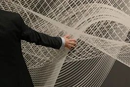


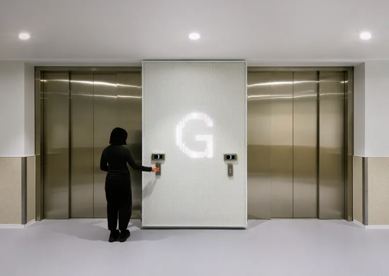
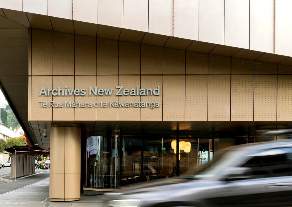
Developed in collaboration with Tihei, the design draws inspiration from the kākahu of Ruhia Pōrutu, a key narrative within the cultural framework of the project. The kākahu symbolises protection, mana and whakapapa, reflecting the role of the campus as a guardian of New Zealand’s documentary heritage, knowledge and taonga.
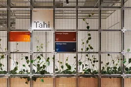
The idea was to create a single wayfinding system that could unify the campus while clearly identifying the different institutions within it.
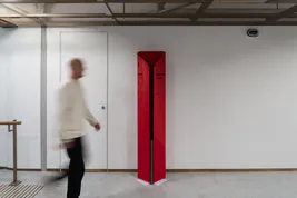
The form of the signage blades is derived from the profile of the kākahu and refined into an open shape that also references the abstracted form of the pipi. Together, these elements connect the wayfinding to the wider cultural narrative of Te Kahu and the relationship between the buildings and organisations across the campus.
A family of motifs inspired by the tāniko borders of the garment was developed to help organise the campus and differentiate destinations while maintaining a common visual language.

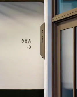
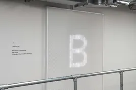
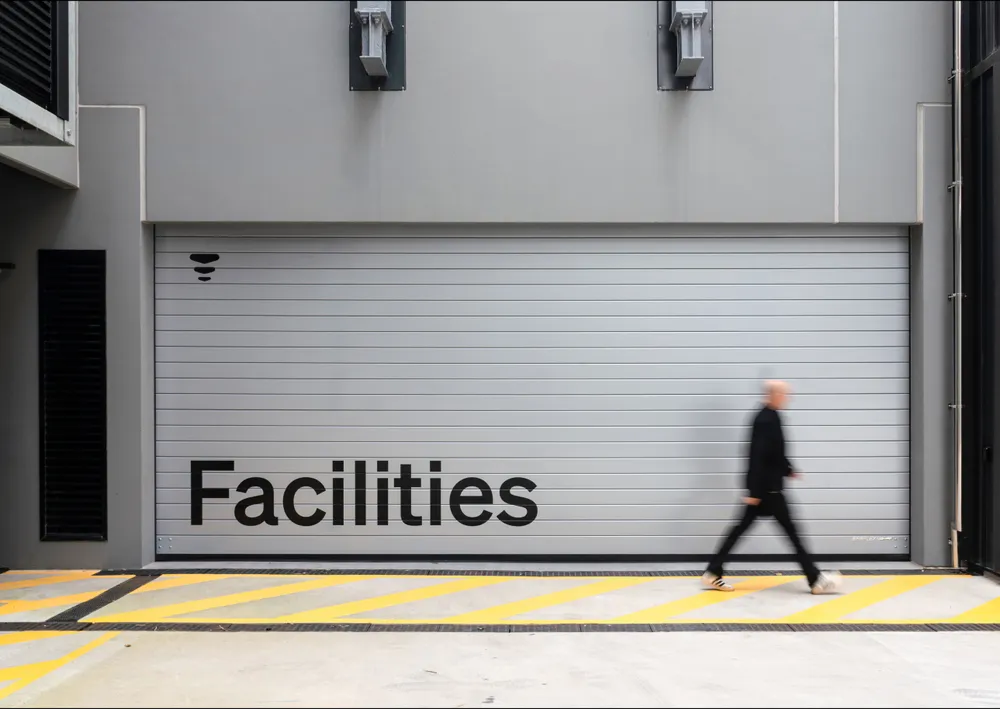
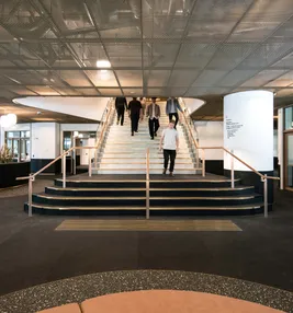
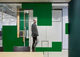
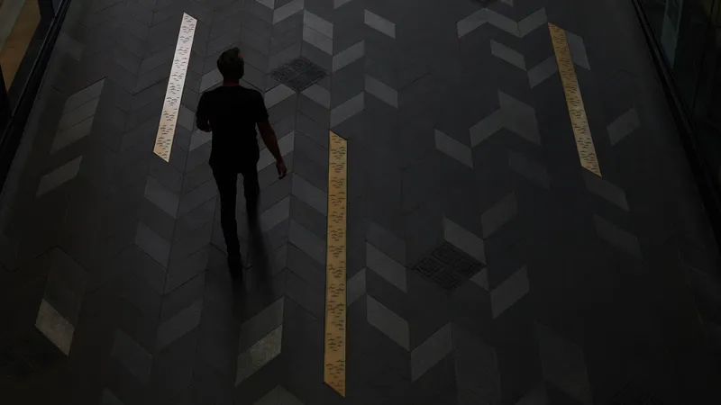
The wayfinding system was designed to feel like part of the architecture and cultural story rather than a separate graphic layer.
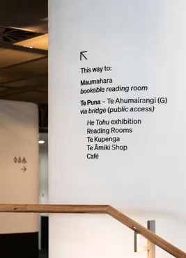
A woven motif derived from the kākahu identifies destinations within Te Puna, while a second motif based on the pipi pattern integrated into the architecture of Te Rua identifies Archives New Zealand. Applied across building identification, directories and directional signage, these elements create a clear and intuitive visitor experience while reinforcing the identity of each destination.
By drawing directly from the cultural framework of Te Kahu and integrating it into the architecture and wayfinding, the system creates a stronger connection between visitors, place and the nationally significant collections and taonga held within the campus.
The result is a wayfinding system that not only supports navigation but also contributes to a more meaningful and memorable visitor experience.
Rather than simply helping people find their way, the project embeds cultural storytelling into the visitor experience.