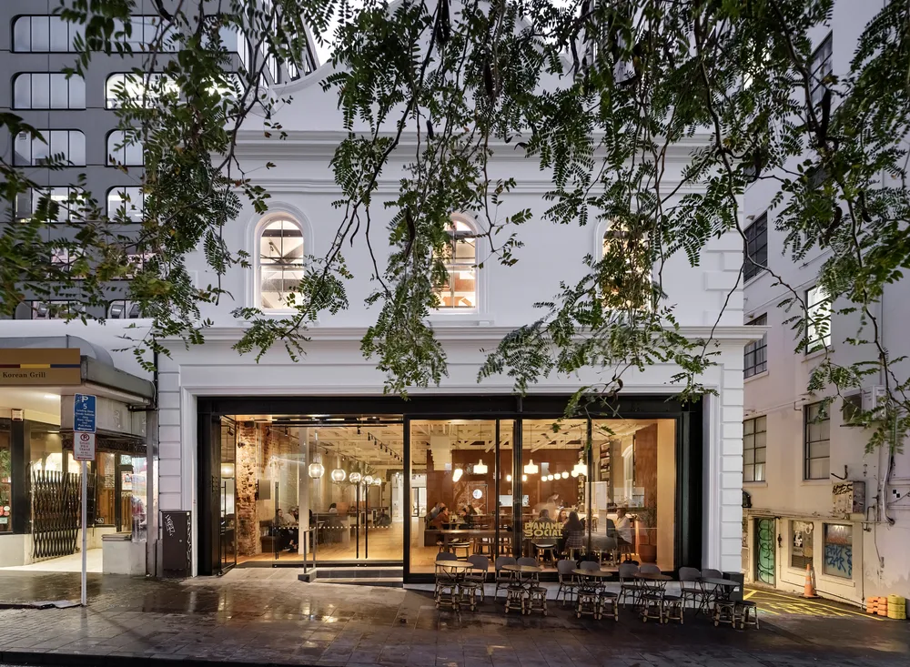
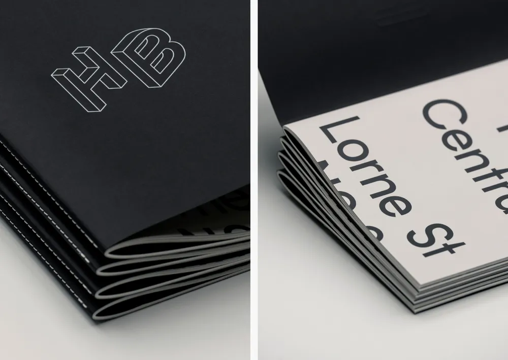
Our strategic and creative response was grounded in the reinterpretation of the building’s rich history and previous functions. Authentic stories of the past sit alongside a contemporary colour palette, and complimentary typefaces inspired by the forms and materiality of the building.
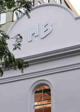
We named the project HB Central in light of its origin as a high-end fashion innovator at the heart of a developing city – redrawing an original brand logomark with a more accurate, contemporary flavour.
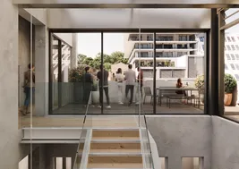
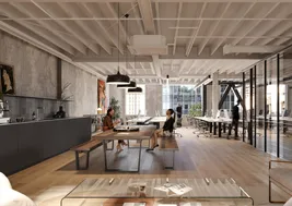
Particularly important to our process was a strong focus on a carefully curated suite of imagery that was informed by the site photography (and found artwork) at the core of the brand. Our team included visualisation specialists with strong art direction that resulted in a cohesive set of renders.
From colour, tone, perspective and composition, to interior styling, artwork integration and user representation seen through the imagery – we produced a bespoke set of visual assets that have helped create a dynamic, authentic, and compelling brand.
Marketing collateral and launch campaign
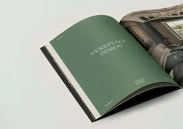
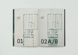
Marketing collateral and campaigns focused on potential tenants. Bringing to life the key value propositions of the building through simple and bold brand statements, and heavier tenancy details through clean informative tables, plans and drawings. Provocative photography and visualisations bring the offering to life.


Signage and wayfinding
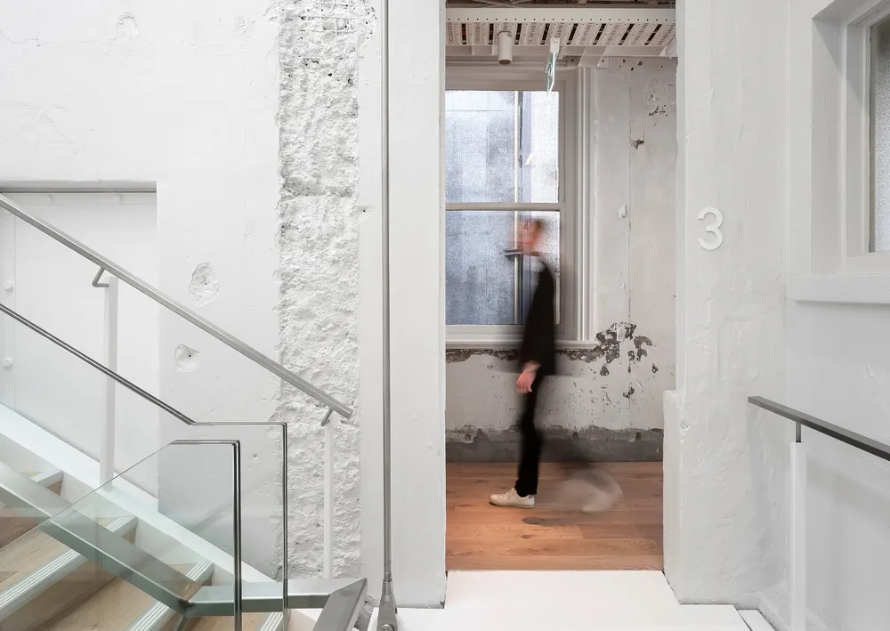
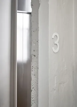
We took a cohesive approach to signage and wayfinding that builds upon the brand identity for HB Central. The designs utilise the 3D forms of the logomark to bring a distinctive look and feel to the functional wayfinding, and an injection of colour to bring life to the exposed concrete, timber, and steel bracing.
