Pulling apart to come together
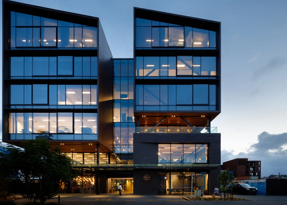
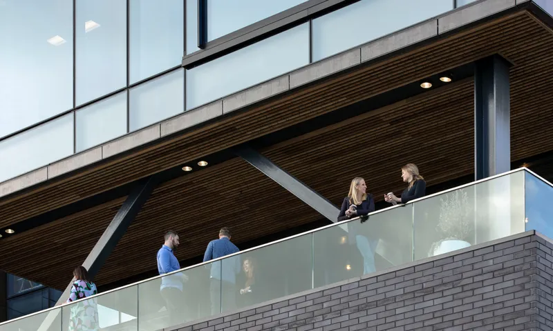
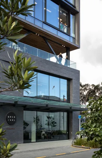
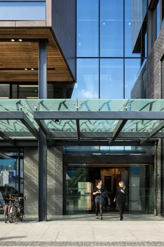
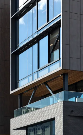
We found is that what innovative companies need the most isn’t more Friday night DJ sets, but more genuine connections. To achieve this, the design pulls apart the upper and lower facade components. This gives the building a human scale and creates a hybrid space at the intersection, giving occupants a chance to engage with each other, the outdoors, and the street below.
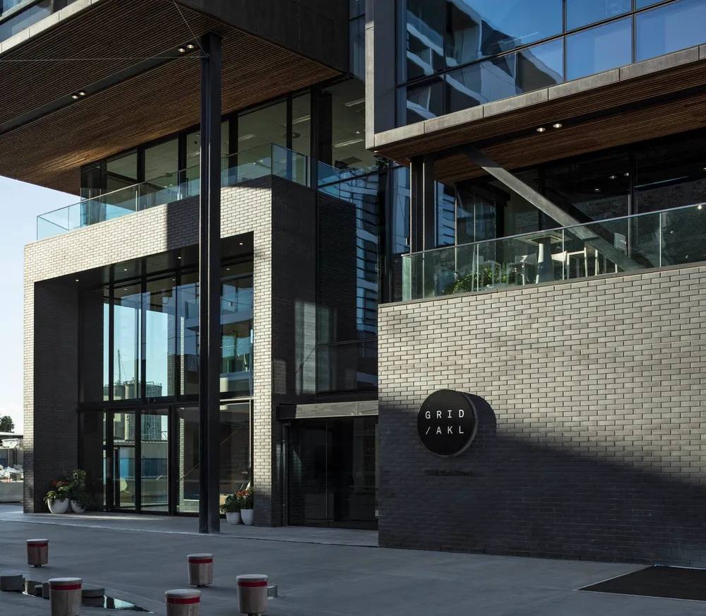
12 Madden Street is a flagship building for us. The 8,500m² space goes well beyond a traditional office development – we have created an environment in which innovative businesses can thrive.
Forming a new identity
As the first new build in the precinct, 12 Madden is a marker of the area's wider identity. To do this, the design and material palette draw from the emerging identity of Auckland as a young, multicultural, ambitious South-Pacific city.
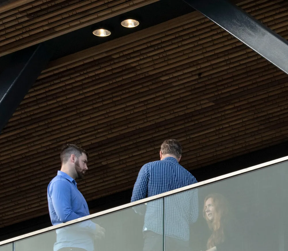
Working with local artist Janine Williams, the designed was inspired by narratives of place. The timber soffit patterning applied to outdoor ceiling areas around the building connects the heavens down with those who use the space.
Traditional tukutuku patterning includes a cross stitch ‘X’ in varying placements within the concept.
Known by many different tribal names including purapura whetu, pukanohi aua and kowhiti, the star-seeds design speaks of the great multitude and multiplication of people and communities like the stars above.
Aotearoa’s most sustainable commercial precinct
The project’s 5 Star Green Star design ambition has driven the design. Wherever practical, the natural finish of materials has been kept or maximised, including exposed structure and concrete floors. The demolition and construction waste target for Wynyard Quarter was greater than 90% diversion from landfill. At the outset of the project this was generally considered to be 15% beyond the market capability at the time. Working with the contractors and the supply chain, the actual demolition and construction waste reduction targets achieved was over 85%.
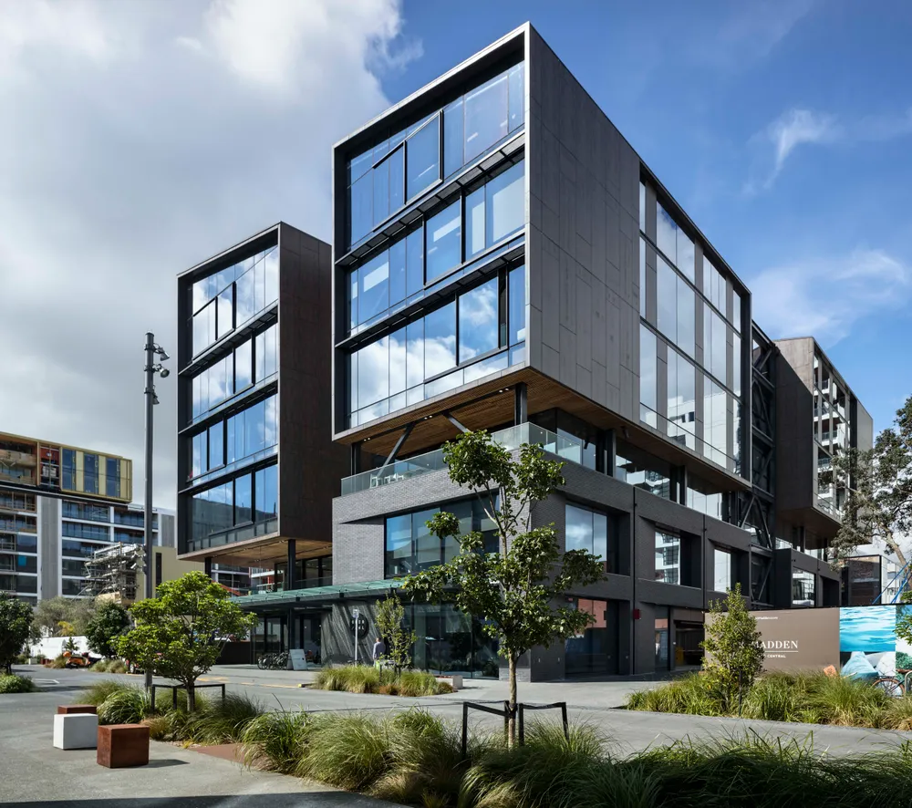
The distinctive roof profile, innovative facade, rich material palette, and urban lane strategy combine to create the antithesis of the commercial norm.
Windows made for opening
A simple but unique gesture for a project of this scale: Upper-level facades are punctuated by operable sliding panels, because sometimes throwing open the windows and letting the fresh air in is all you need for a good idea.
